How to read and interpret a titration curve
June 10, 2026
Blog article
 Share via email
In many laboratories, the primary output of a titration is a single number – the reported concentration of the analyte. While that result is important, it represents only a small portion of the information generated during the analysis.
Every autotitration also produces a titration curve, which shows how the sensor signal changes as the titrant is added. This curve provides valuable insight into the chemistry of the reaction and the performance of the method itself.
A titration curve is essentially a visual record of the entire titration process. Learning how to interpret a titration curve can help analysts diagnose unexpected results, optimize method parameters, and better understand how the titration system is behaving.
Quick Answer: How do you read a titration curve?
A titration curve shows how the measured sensor signal changes as titrant is added during an autotitration.
- By examining the shape of the curve –the initial region, the reaction slope, and the equivalence point – analysts can understand how the chemical reaction is progressing and whether the titration system is behaving correctly.
- Interpreting the titration curve helps identify issues such as slow sensor response, buffering effects in the sample, unstable signals, or dosing parameters that may need adjustment. For this reason, the titration curve is often the most valuable diagnostic tool in autotitration.
The basic shape of a titration curve
A titration curve plots the measured signal of the sensor against the volume of titrant added during the analysis.
Depending on the type of titration being performed, the signal may represent:
- pH in acid–base titrations
- electrode potential in redox titrations
- ion activity for ion-selective electrode titrations
Although the chemistry varies, most titration curves follow a similar structure. As titrant is added, the signal gradually changes until the reaction approaches completion. At that point the signal shifts rapidly, creating the characteristic transition associated with the equivalence point.
Most curves contain several recognizable regions that correspond to different stages of the reaction.

The equivalence point: where the reaction reaches completion
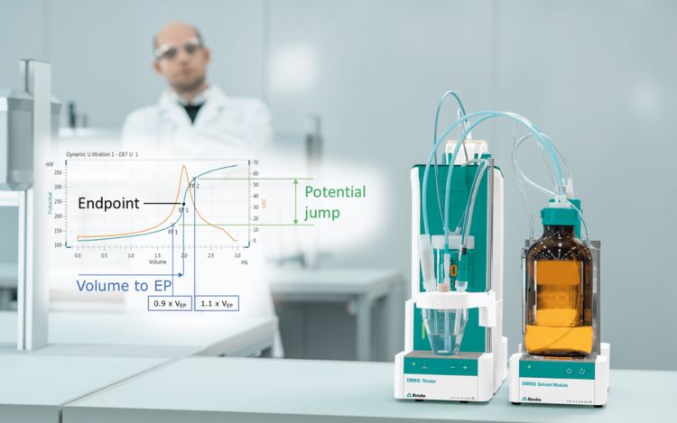
As the titration approaches completion, the sensor signal begins to change more rapidly. This transition marks the equivalence point — the moment when the analyte has reacted completely with the titrant.
On the titration curve, the equivalence point typically appears as a steep inflection in the signal. Modern autotitration systems detect this transition mathematically by evaluating the slope of the curve.
When the equivalence point is well defined, the curve shows a clear and sharp transition. This usually indicates that:
- the reaction proceeds quickly
- the sensor responds efficiently
- dosing control is properly aligned with the chemistry
Sharp equivalence points generally produce the most reliable titration results.
When the curve looks different than expected
Not all titration curves behave ideally. In many cases, the shape of the curve itself provides clues about underlying analytical problems. By examining the shape of the curve, analysts can often identify issues with the chemistry, the sensor, or the dosing strategy.
For example, flat curve shapes may indicate:
- strong buffering effects within the sample
- slow electrode response relative to titrant dosing
- unstable sensor signals or poor mixing conditions
While noisy or irregular curves can be caused by:
- unstable electrode signals
- poor stirring or mixing
- air bubbles or particulates in the sample
Titrating past the equivalence point may mean:
- dosing increments are too large
- sensor response is lagging
Because the curve reflects the entire titration process, these patterns can often be identified before they significantly affect the final reported result.
The initial region: establishing the starting signal
At the beginning of the titration, the sensor measures the signal of the untreated sample. This initial region establishes the baseline from which the rest of the titration curve develops.
A stable starting signal is important because it indicates that the sensor and sample environment have reached equilibrium before the reaction begins. When the baseline is unstable, the curve may develop irregularly and make endpoint detection more difficult.
This region can often reveal early signs of potential issues, including:
- electrode instability or poor conditioning
- temperature drift
- insufficient mixing of the sample
When the signal stabilizes quickly and remains consistent, it provides a solid foundation for the remainder of the titration.
The reaction region: where most of the chemistry occurs
As titrant begins reacting with the analyte, the sensor signal starts to change. This portion of the curve reflects the ongoing chemical reaction taking place in the titration vessel.
In many systems, this region appears as a gradual slope rather than a sharp transition. The shape of the slope is influenced primarily by the chemistry of the sample, but several other factors may influence how this region develops such as:
- buffering capacity of the sample
- reaction kinetics
- titrant concentration
- sample matrix effects
Highly buffered samples often produce flatter curves, while simpler reactions produce steeper changes in signal.
Observing how quickly the signal changes in this region can provide useful insight into how efficiently the titration is progressing.
Multiple equivalence points
Some titration reactions produce more than one equivalence point. This occurs when multiple reactions take place during the titration.